Every hear of a kea bird? Right now I bet we are all a little like a Kea bird. They are a member of the parrot family, and may be the smartest bird on the planet. When bored, they are definitely the most destructive. Thanks to COVID19, we are all simultaneously bored and anxious, which feels AWESOME!!! So I’ve been trying to stay busy and do things to keep myself occupied.
As avid fishers, especially fly fishing we have a TON of equipment. We would like to hang some of itvisibly, and decoratively.
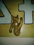
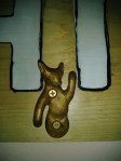
My husband has these little brass animal hooks that were his paternal grandmother’s for hanging an indoor clothes line that have been rattling around in the back of my mind. He has wanted to use them for something but we haven’t really been able to think of a good project for them. He was very close to his grandmother, and the hooks always remind him of his childhood and her home in the Upper Peninsula of Michigan.
He got a pretty serious injury a while back and his physical therapist suggested he go fishing as often as possible to get mobility back (it is a surprisingly good low impact stretching exercise for the upper body) and the constant pile of gear that had to be taken out and put away gave me an idea for what to do with those little brass hooks. He has a station for tying flies in the hobby room and I got him this lovely framed print of vintage fly fishing equipment for above it. I thought that I could use those hooks to create a fishing station of sorts for the fly fishing gear. Constructive, not destructive, an excellent project for times like this.
I decided to make him a “vintage Americana primitive” style sign, with a bit of a coastal feel to it. I spent a few days cruising around the interwebs to see what other people had done and ran them past him to see what he found appealing. He liked the aesthetic of one image that reminded him of the ceramic platter with a brook trout on it he also inherited from her. I used that image as the basis of my composition, and then modified it accordingly. Mostly we came across decorative signs, that didn’t really have a function. We wanted something functional, and not just decorative. Decorative for the sake of decorative is pointless. Decorative and functional, or as I like to think of it “function with informed styling” is my personal ideology.
The first step was finding a nice piece of knotty pine. I chose a 12 inch wide piece of lumber, and since I have a few other projects in mind for later, I bought an eight foot board. Once I got it home, I cut it into three sections; two of which were 36” and one was 24” long. Once I got them cut, I took a sanding block to all of them and smoothed them down, then tack clothed them off. I put the other two away for now, and made a rough pencil draft of the fishing sign. I wanted to incorporate the knot holes that I so carefully selected for, so I made sure that my design used them to best effect.
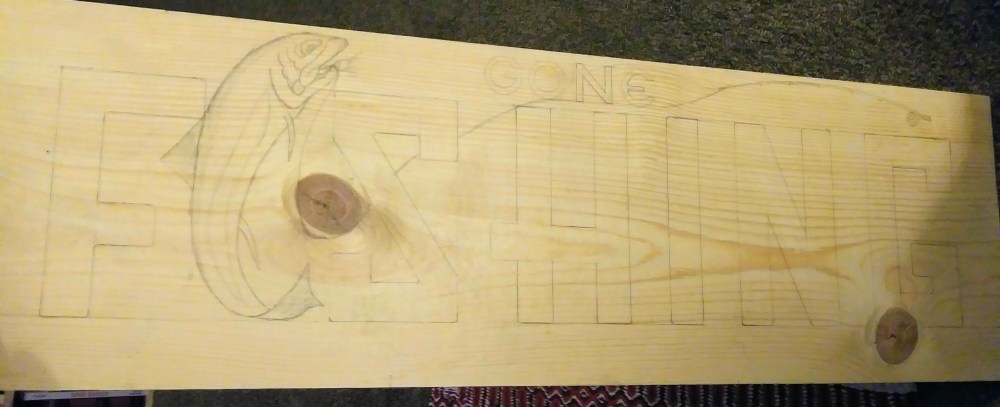
That took far longer than it should have. I was trying to get a vintage feel so I redid the font about eleven times before I finally settled on that hybrid font you see. I spent waaaay too long looking at the facial structure of trout. I’m a perfectionist. So after I did all of this detail, then I had to go out of my way to figure out how to make it more primitive. I finally decided on being heavy handed with the liner brush at the end to give it the rugged and primitive look while still having a pretty high level of detail.
After I got it all laid out, I decided to do a modified redline technique and blocked in the letters and fish with a red acrylic wash. This fills the rough surface of the pine in and allows the paint to adhere to it better. Once the wash was dry, I used a white acrylic wash to tone down the red in areas that were eventually going to be a solid paint color. This is the net result.
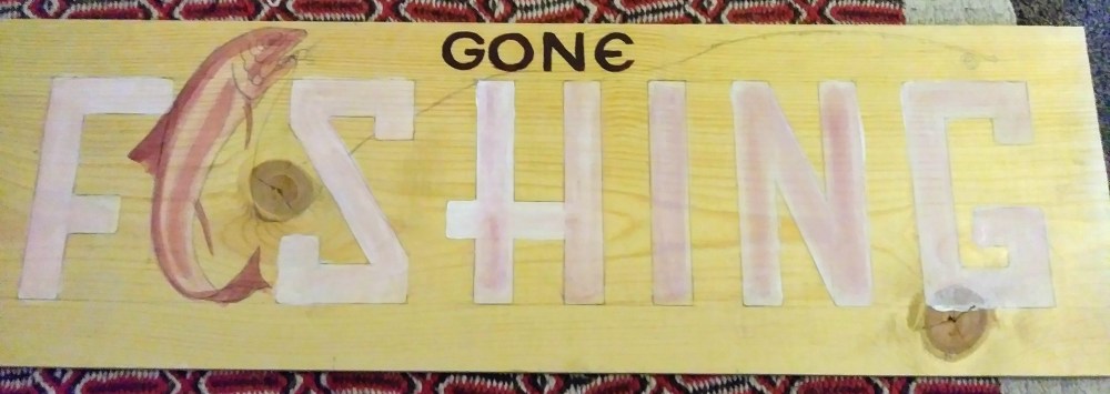
After letting it dry a few days, I gave it the finish paint and lining. I decided at the last minute to give the word “gone” some dimension by giving it a two tone treatment with a back wash. I really liked the effect. For a minute, I was going with the paint splatter method of distress and immediately hated it. I took the below picture before I removed most of it. I don’t think that the technique is a bad one, I just think I was too heavy handed with it.
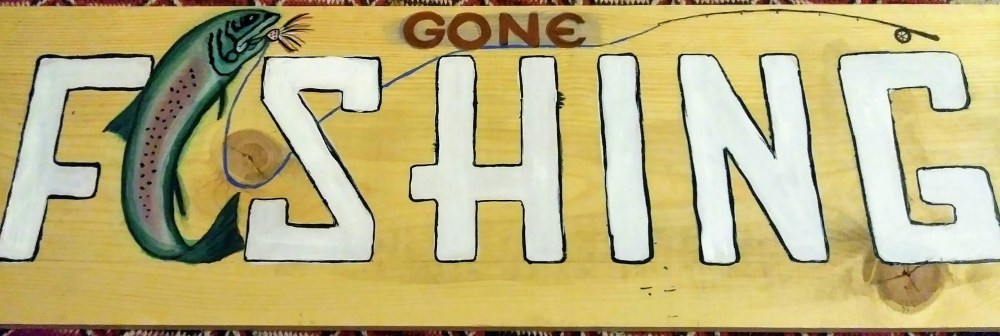
I gave it several days to dry, and then gave it a final sanding with 1000 grit wet/dry sandpaper. This was mostly to smooth out the thicker portions of paint (specifically the heavy handed lining) and make sure the surface was ready for a finish. I like to use Minwax Polycrylic. I am not sponsored by anyone, I do this for fun. If I give a recommendation, it is because I actually mean it. I like the finish it gives wood. You can still feel the grain under your fingers, but it gives a nice depth to the wood, warmth, and a good finish.

However, I didn’t want to put it straight out of the can onto the wood, because I was going for a vintage look. So to that end, I added a single drop of blue acrylic paint to 1/3 of a quart of the polycrylic. I mixed it thoroughly and ended up with a bright blue finish. My husband looked at it, then at me like I was nuts. I was trying to get a twofer out of this with vintage AND coastal, thus the blue. I could have used a brown also, but I was trying to subtly imply water, and also go for that silver look unfinished wood gets when it weathers for a really long time. This is the color of the polycrylic after I added the blue. Looks intense, but I assure you it mellows out when it dries.

I totally forgot to get a photo of the board with three layers of finish, but before adding the hardware. It turned out to be a super difficult task to get a decent photo of the sign at all. The artificial light is too warm for the blue tones, and the natural light washes it all out. This is a mixture of both, and it unfortunately has a glare. However, you can still see the effect the finish gave to the sign and the depth it gave the paint, particularly on the trout. There will be more detailed photos of the individual components below.
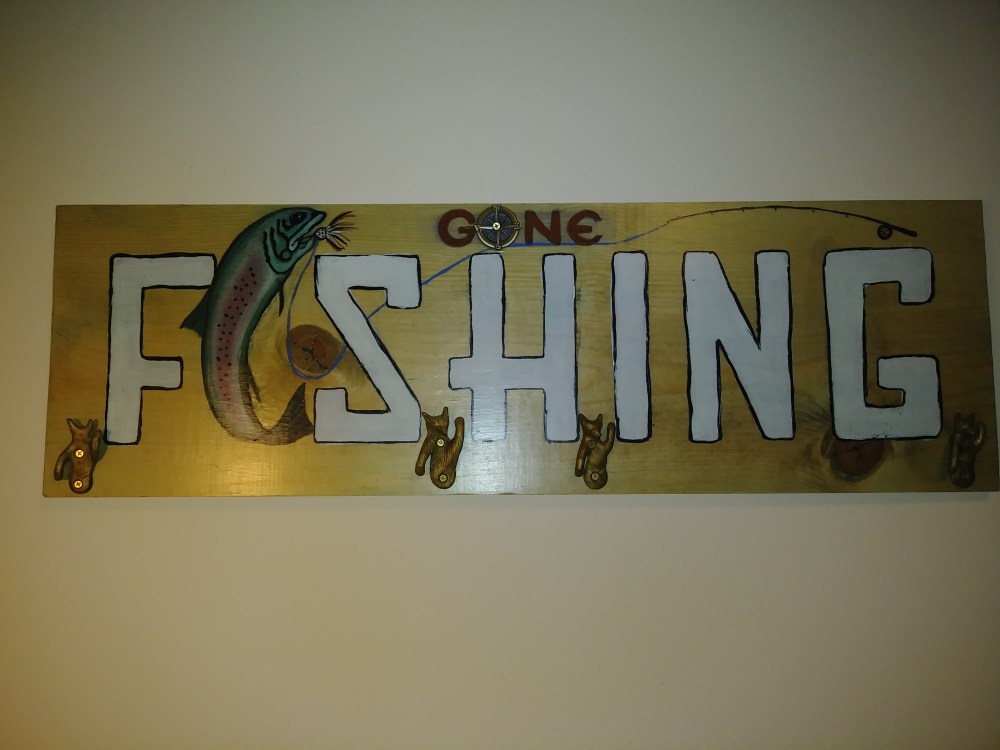
The little brass hooks I have mentioned so many times are in the shape of foxes and bears. The upturned paws were going to be used as hooks My husband has landing nets, fly vests, lanyards and all that, and I thought that this would be a far more decorative and aesthetic manner of storage than we had used previously, which was to hang them in the closet.
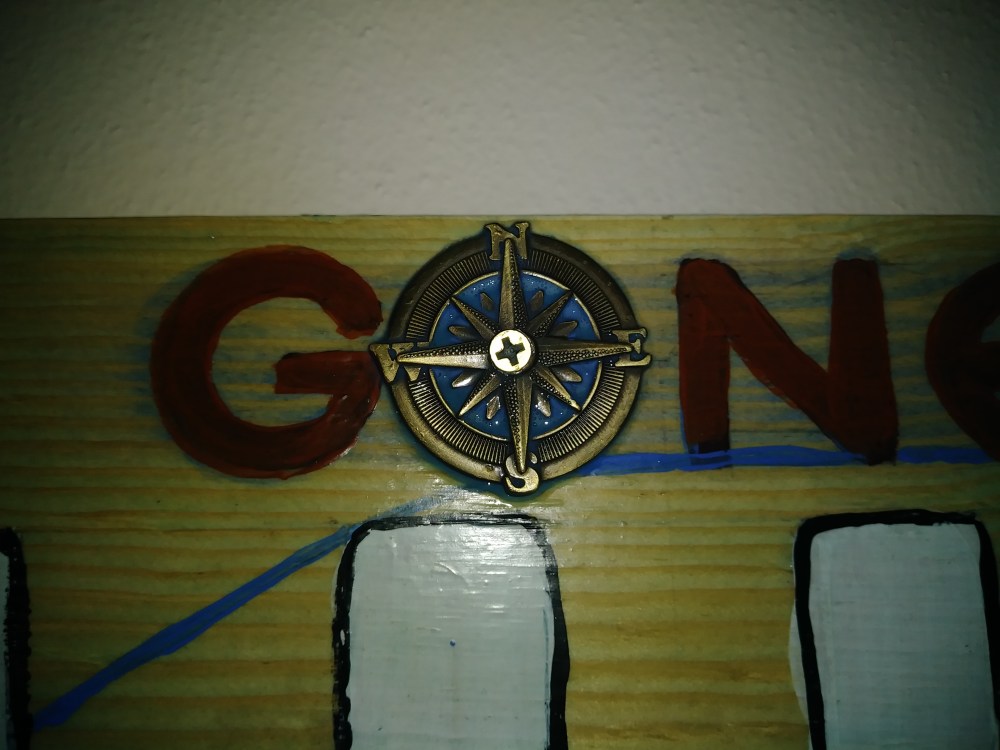
While rummaging around through my various craft items, I stumbled across this compass rose pendant I have had for some time. I think I originally intended it to be a watch fob for one of my husband’s pocket watches, and was disappointed that it wasn’t actually brass (pet peeve- if you order something online that says it is brass, it should be brass and not brass plated). I had not used it for anything because it is a base metal with brass plating, which will inevitably wear off, and it is also pretty heavy. I decided to use it in place of the “O” in the word gone. I hemmed and hawed with how to attach it before I finally decided to go with the most primitive looking method possible and drilled out the center for a regular old philips screw. The entire point of the rugged Americana look was that it was made with what people had on hand. I rather like the way it turned out. I put a layer or two of finish over the medallion to make sure it would not discolor with age. It is a base metal after all, and I have no idea how it will respond to real world atmospheric conditions.
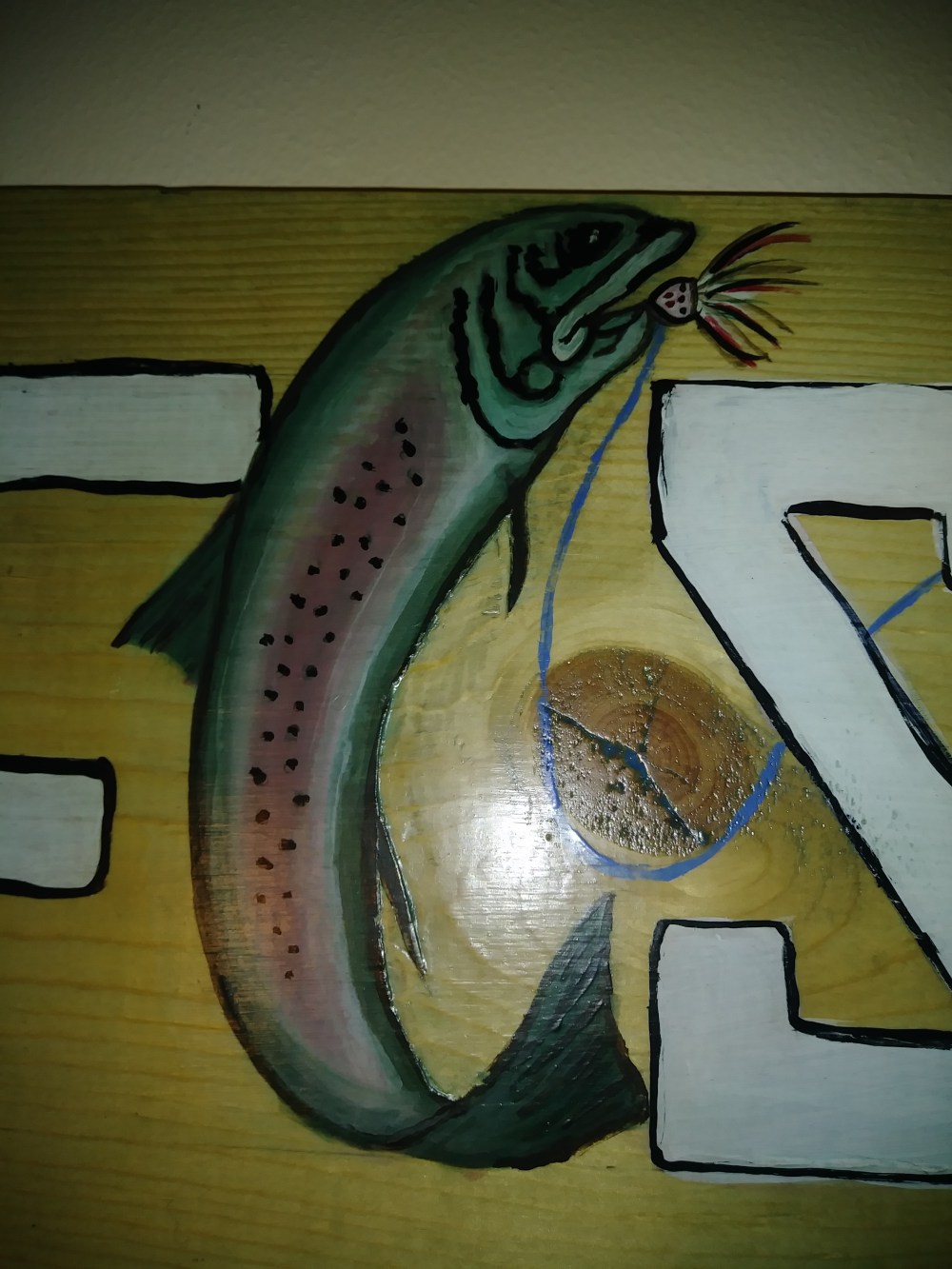
One of the things I was most please with was the way the trout looked after it was coated. Since I was really light handed with the paint in many places, really only washing it with color, and then applying it much heavier in others, the grain of the wood shows through and gives it some three dimensional qualities. I was super pleased with it and was almost exactly what I envisioned when I started the project.
All that was really left was to attach picture hangers to the back, and the mounting hardware to the wall. Once it was up, we put all of our trout fishing gear on it. Again, it is hard to photo and get true color. This is a mix of artificial and natural light, which really washes it out. It has a wonderful light blue cast to it that both makes it feel old and marine. I didn’t think to take a detailed photo of the fly rod on the sign, but I went all out of that as well; the reel and rod have a lot of detail.
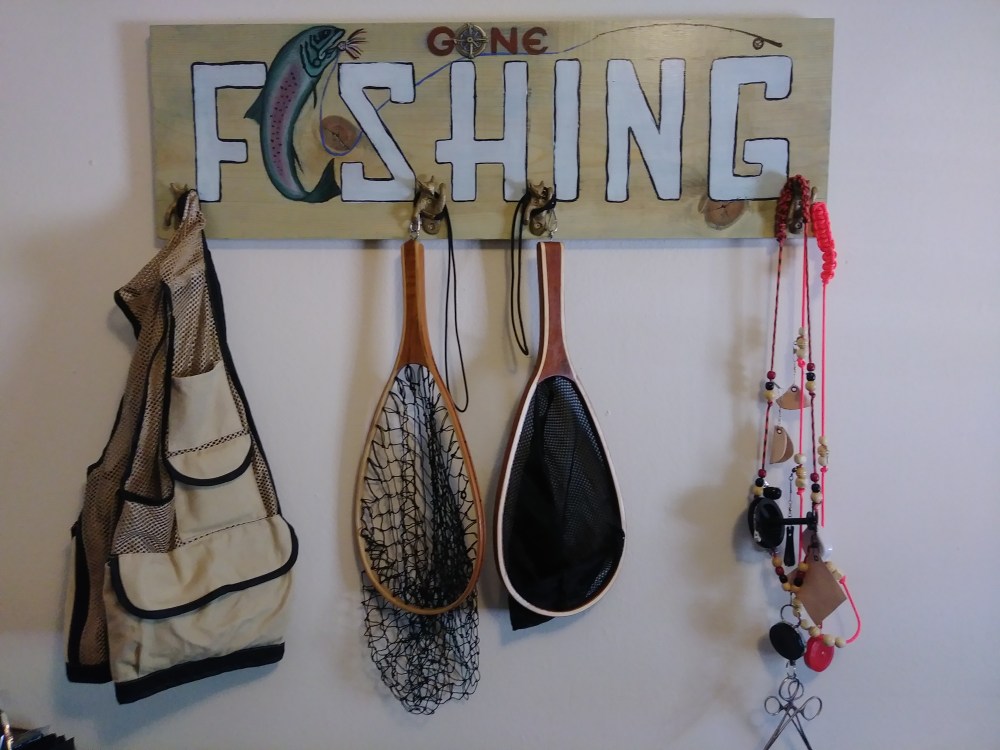
My husband was very happy with the finished project, not only because it gets the fly fishing equipment up and more ready to go, but because it reminds him of his grandmother every time he sees it. This is a project that could easily be done with modern hardware, and even give it a different design entirely. If you like the midcentury modern style, you could make a similar sign to hang equipment on by using a plain, clear piece of wood, washing it with polycrylic (use a drop of brown for color) or stain it. Some plain, simple dark metal knobs would work instead of the brass hooks. Similarly, you could use a honey chestnut finish and square wooden pegs for a Shaker style. If you choose to make one, whatever style you choose is bound to be a far better alternative than a closet, tote, box, or garage.
It could be a great project to work on together, designing and making finishing selections. If your whole family fishes, you could make it a family project with each member having their own design and personalized sign for their equipment. I hope you decide to make one yourself, and if you do, post the results!

